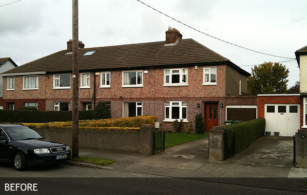
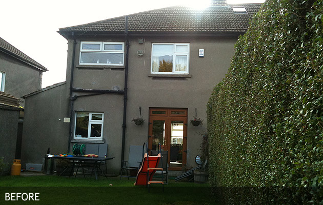
Large extension to this 1950s terrace house. Modern family needs required that this project gain as much light and inexpensively heated room as possible, while balancing the look of the house + extension in its neighbourhood. Planning permission and planning appeal decision gained, and construction phase progressing well.
Construction Phase: April 2012 – October 2012
Before front view
Before rear view
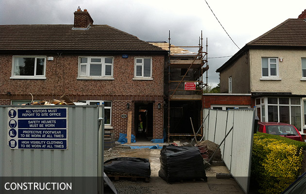
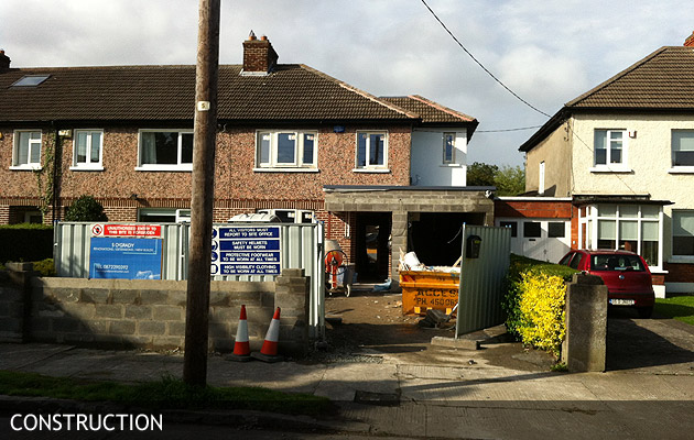
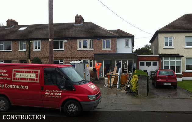
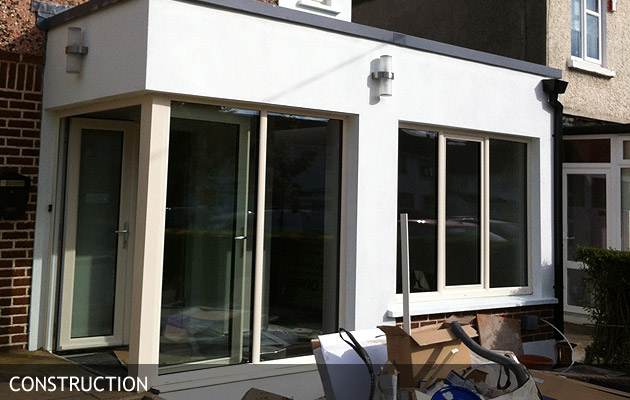
Construction July 2012 Front View
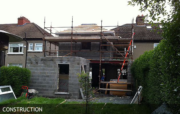
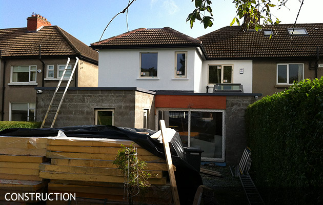
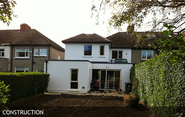
Construction July 2012 Rear View
Construction Early August 2012 Front View
Construction Early August 2012 Rear View
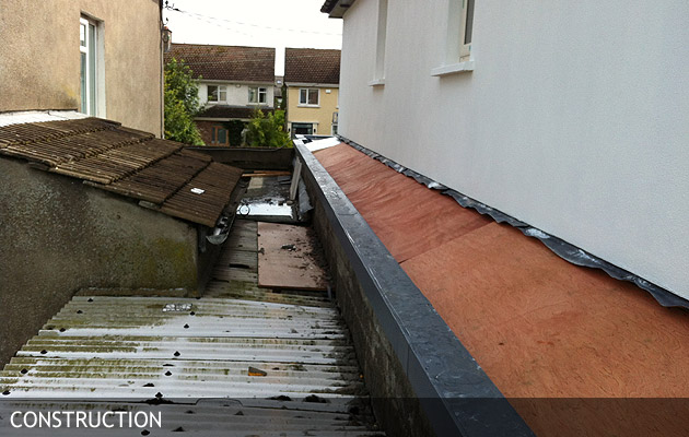
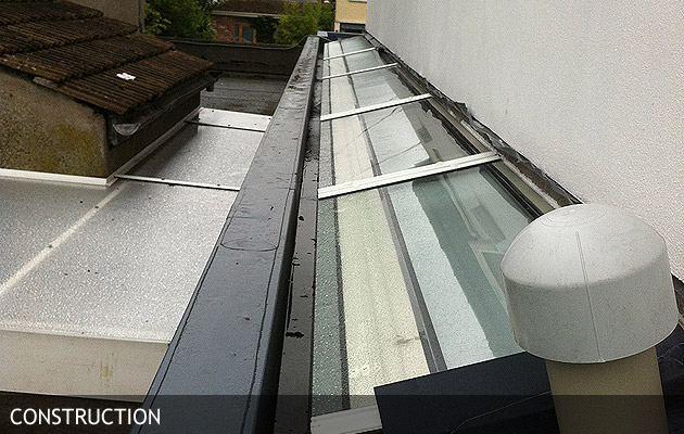
Preparation works for our ‘glazing blade’ – a 10.5 metre long ‘blade’ of glass forming a lightwell over the dining room, kitchen and w.c. This will achieve unusual and beneficial natural daylight for these rooms, and a weightless appearance for the new storey built above. Images of the glazing in place will follow.
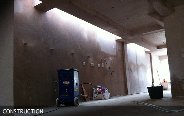
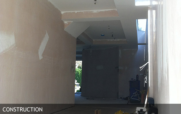
31st August – Achieving our ‘glazing blade’ – now plastered to interior. Hint of natural daylight ‘draping’ down to open plan front porch, dining room, kitchen, and over into downstairs loo. New first floor extension apparent over ribs of steel beams.
Achieving our ‘glazing blade’ – Triple Glazed to 0.9 u-value, our glazing while being installed and flashing being formed for weathering.
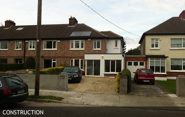
Front Elevation End of August 2012. Progress is Excellent and On-Schedule and On-Budget. Very Important on a Project Like This, We Find We Have the Support of Adjacent Neighbours.
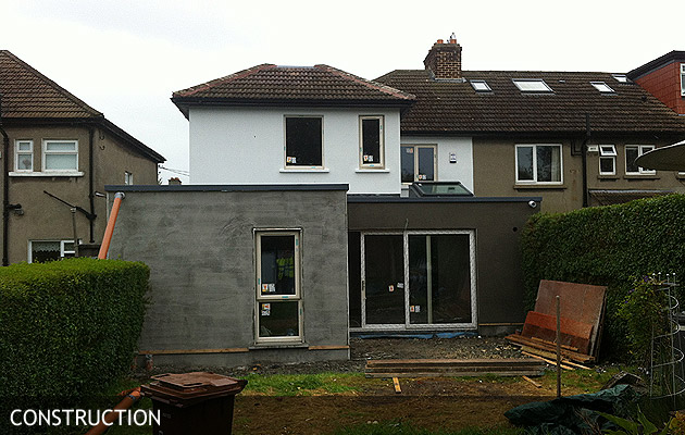
Rear Elevation End of August 2012. Looking Forward to Finishing Here and Landscaping/Lighting spec. to be Installed.
13th September 2012 – Natural Light Penetrating Deep Into the Living Space and Washing Down these Walls
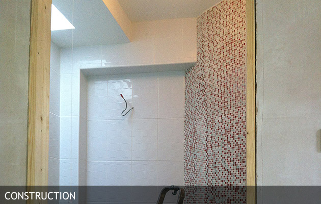
13th September – Tucked Away Bathroom being Tiled – Curved Wall from Kitchen Being Tiled With Mixed Pink Mosaic
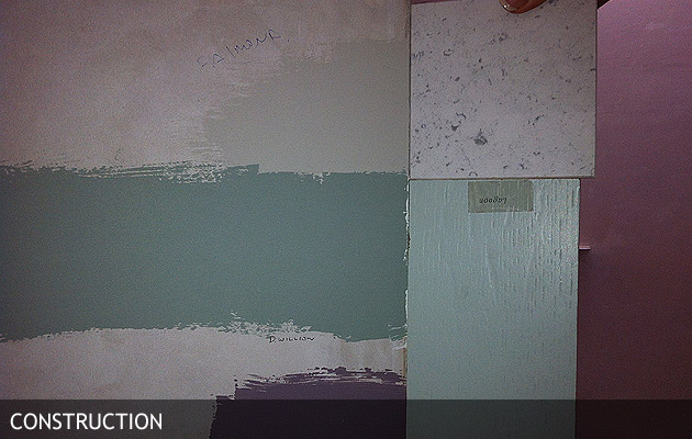
13th September 2012 – Picking Colours for the Kitchen, Dining, Home-room Open Plan Area. The Dark Green to the Left is Delicate Willow from Dulux, a Beautiful Deep Colour Here Applied to The Curved Wall Which Swoops Around From the Kitchen to the Homeroom
4th October 2012. Front porch detail.
4th October 2012. Rear view of extension.
15th October 2012. Front view of extension. Very close to completion and snagging.
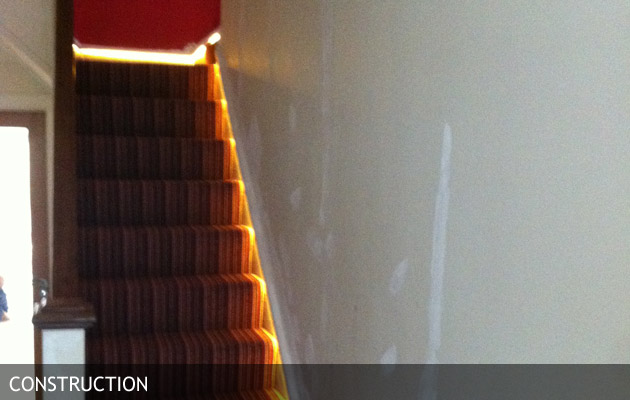
15th October 2012. Here we are working on the stair-light idea. Using a hidden LED rope, we are lighting the string of the stairs along its entire length and as it splits in two directions at the top. The LED rope is in turn connected to sensors on the upstairs landing and downstairs hallway – so when the children move around at night, the stairs is effortlessly aglow for them!
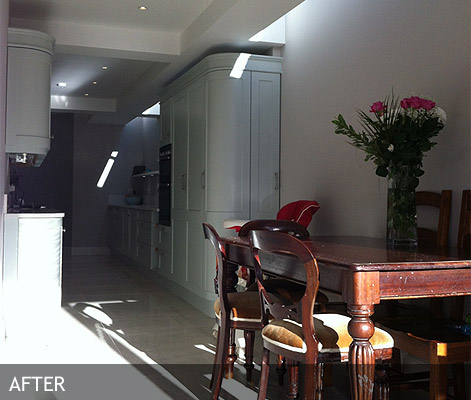
This photo is taken on the 20th November 2012. Just look at that sunlight coming through the front porch windows, penetrating through the new dining and kitchen areas. This is Ireland in November. And this is a house that is now heating itself from sunlight in an Irish winter. Sunny dining days ahead for Julie and David . This section used to be the side garage by the way.
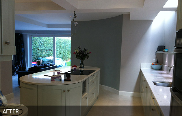
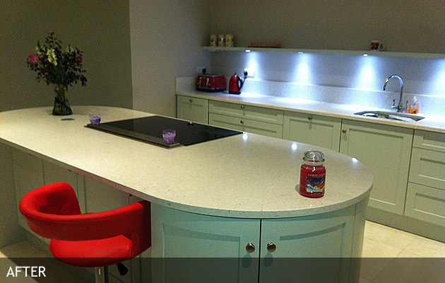
Again, 20th November 2012. The kitchen area, open through to the front and the rear via a family/play room which opens onto the rear garden. This also shows the curved wall, which is reflected in the shape of the kitchen island. The curve has really worked to soften the geometry – break down all those sharp edges, and to lead naturally from one room to another. This area is at the core of the house, and typically would not have natural light as the walls abut the neighbours garage. We sculpted back the new rooms in the storey above so that we could achive the ‘light blades’ of glazing in the ceiling. Look at that light, Clontarf in November.
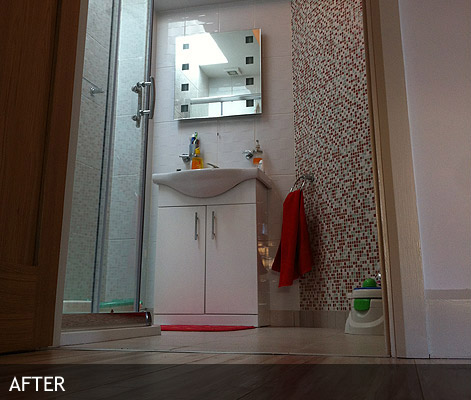
This is one of three new toilets in the project. Its the smallest but kind of my favourite, as it was always the underdog! Its the inverse side of the kitchens curved wall. Julie my client arrived with these mixed red mosaic tiles wondering if Id hate them, but I love them. Looking in the shaving mirror you can see the natural light from the ‘light blade’ which continues into this room. Otherwise it would be dark, artificial light, and artificial extraction.
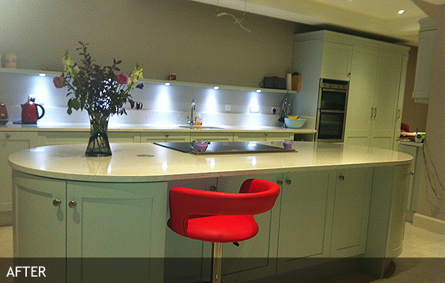
This is the fun of finishing a project (after much hard work all round!). The client has sent through some photos of a sample stool she’s sourced for the kitchen island. Is the red too much, is it just right?
I think the red stool will be fantastic. Its like a cocktail bar in Singapore. I love it. What do you think – comments to over@planningworkshop.net
